
Problem Definition
Defining a Problem Space
When approaching the task of a redesign without many limitations, our team had multiple brainstorming sessions in order to narrow the focus of our idea. To decide on a problem space, our team members each came up with one problem that we could solve. Multiple members had ideas that centred around navigation or finding certain amenities on campus, so we combined those ideas together. As a group, we decided on our favourite three, then made a Decision Matrix to finalize our idea.
The Decision Matix takes into account three criteria, the first being optimizing student time. This is important as students have to balance many things at school — studies, co-op, and social life, to name a few — and more time to do things is always welcome. Secondly, we wanted to redesign something that improved the quality of life of students; this was rather important, as it would entice and attract students to use the upgraded product. It would be helping students directly, instead of giving them a solution they never asked for. Finally, safety is key. Our team wanted to make our product increase inclusivity on campus, which includes making sure students and staff feel safe while on premises.

Project Context
As a university known for its academic aptitude, the University of Waterloo has put a lot of focus on creating workspaces for students that promote effective study, whether you want group study in the basement of DC, or silent study in E7. When determining which aspect of UWaterloo to redesign, our team was keen to find a way to get rid of the ‘gatekept’ study spaces and make comfortable study spaces accessible to all students. We are trying to find a way for students to study as healthily, efficiently, and effectively as possible. In the brainstorming stage of the project, our group came up with a few guiding questions:
What is the current study process? and
What are the biggest time wasters in the study process?
After careful deliberation, it was concluded that the study process begins the moment one decides in their head, packs their study bag, looks for a place to study, finds a place to study, and then studies. The biggest waste of time in the study process is finding a suitable location to study. Many students prefer studying and doing work in an environment different from their home/apartment/dorm. As of right now, if students want to study, they are limited to the study spaces they already know of. Students will go across campus trying to find the ideal study spot.
Overview
Problem Statement
Current System
In order to leverage UWaterloo’s existing digital architecture, we decided that Portal would be a great starting point for the basis of our redesign. The problem with the University of Waterloo’s current portal map is that it is incredibly outdated and not able to provide up-to-date information. There is no way for students to tell how accurate the information surrounding study space is, as the app provides no information on this. There is also no built-in navigation feature, and maps of the various tunnels and bridges on campus are hard to access and utilize as there are constant changes in closures and timings.
UX Success Metrics
User Research
Before the prototyping stage, the team conducted various methods of user research in order to gauge a better understanding of the scope of the solution, user perspectives, and key areas of consideration for the design.
Contextual Design Analysis
User Personas
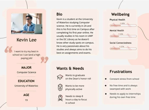
For our user persona, we focused on a typical Computer Science student at the University of Waterloo. We shaped their personality through interviews with CS/Engineering students, generalizing their goals, frustrations, and study habits. Most interviewed students primarily studied in one or two spots, typically the DC Library or their room, and expressed interest in exploring other spaces but lacked awareness or motivation.
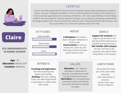
For our extreme user persona, we chose an undergraduate advisor. During an interview, they shared that while they sometimes get bored of working in their office, they avoid taking students’ study spots. This persona represents an occasional user of our app, likely using it infrequently. We also considered that staff or professors new to the Waterloo campus could benefit from the app for navigation, combining these traits to create this persona.
User Scenarios
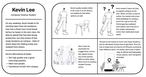
Kevin is a second-year computer science student at the University of Waterloo whose main goal is to do well in school and land a good co-op placement. To do so he studies very hard, but only knows two locations: his UWP room and the DC Library. He longs for new study spots, and asks his roommate before eventually turning to online student forums to find new study spaces. However, he struggles to navigate to these new places, and wishes there was a better map he could refer to.
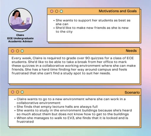
Claire is an ECE undergraduate academic advisor. She is new to the university and wants to explore different study spaces on campus. She has trouble with directions and does not want to waste time by accidentally getting lost. Moreover, Claire has 90 ECE quizzes to grade weekly that she would like to do someplace on campus in a collaborative space so she may meet new people. She does not have a lot of time in the week to explore, so she hopes to find a place that is easy to walk to and from E7, where her office is located.
Iterations and Prototypes
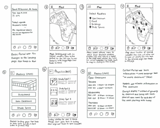
Prototype 1
Low Fidelity
Design Features
These sketched frames depict a user's journey through our app, starting with the UW Portal landing page and navigating to a revamped campus map. Key improvements include relocating the menu button, listing open classrooms by day instead of by room, and introducing a new feature: a list of available study spots. This allows users to find study areas without wandering around campus.
Testing
We ran the first usability test on the low fidelity wireframes. We sat down separately with 4 potential users to discuss features they like/dislike about the prototype and what they would like to see in the future
In summary, three common experiences/feelings were observed in all four users:
The existing filtering system was hard to navigate and that a further filtration system would have been more helpful. Users said that sometimes they look around campus for a group study spot, or sometimes they are looking for quiet study
All users liked the direction feature, but ¾ would have liked it more if there was an option to go to the study place via indoor routes. They said that in Winter, it is hard to walk outside, but they are not sure how to use bridges so a direction feature to navigate bridges would be extremely helpful.
¾ of the users said they would like to see a feature that put together popular study spots which they could access without filtering through. They said they often trust the opinion of other students who have had positive experiences with a study spot.
Prototype 2
Medium Fidelity
Design Features
This prototype included three additional features based on the feedback from the low-fidelity prototype. First, we included a further filtration system that allowed users to find a study spot based on volume, proximity to food, preference of group/quiet study, etc. The second feature was the option to view popular study spots, whether that be group, quiet or most liked study spots. The last key feature was a navigation system that would allow users to get directions to various locations with the option of going only via indoor bridges and tunnels.
Testing
We ran the second set of usability tests on the medium fidelity wireframes made in Canva. We sat down separately with 3 potential users to discuss features they like/dislike about the prototype and what they would like to see in the future
Overall, four common experiences/feelings were observed in all three users:
Filtration System: All three users preferred a simpler filtration system. Users found the current setup (scroll up for pre-selected filters like group study, silent study, etc., and scroll down for custom filters) unnecessarily complex. Users preferred having just one filtration system.
Group Study Feature: Highlighted as important, as finding spaces for large groups is often challenging.
Interface Design: 2/4 users found the lack of color made it harder to see selected filters, negatively impacting the interface's appeal.
Navigation Feature: 4/4 users praised the navigation feature and suggested no changes.
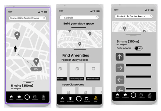
Prototype 3
High Fidelity
Key Design Features
Based on the user feedback from the medium fidelity focus group, we decided to implement a new feature in our final prototype. In response to the feedback regarding a greater emphasis on studying in groups, we added a feature where students can either create or join study group sessions. This allows students to work together on a specific project or course or even gives them the option for socialization if desired.
Testing
To test this prototype and brainstorm for future iterations, we decided to implement the ‘paper and pen’ usability assessment model digitally. The general layout of our frames was confusing to navigate, but this was done intentionally so users would not default to the logical sequential order of user flows. To complete this task, we asked three users of different age demographics (18 to 50) to navigate our application in order to find a study spot in Davis Center. There are two possible ways for users to access this task, so we were curious to see which path would be favourable. The average path of the three users was as we anticipated, although we noticed that users defaulted to using the flow that had more clicks. We expected that users would default to opening the map view if they already had a study spot in mind, but instead, they went through the “find a study spot” pathway
Overall, the main takeaways from conducting the activity analysis were:
From the onboarding page, users were inclined to go through the ‘find study space’ flow.
Once in study spaces, users used “view map” to narrow down the spaces in list view.
It was confusing to find the next page due to the way the frames are ordered.
Overall, it is easy to navigate between pages due to the layout of the buttons/home.
Attention was focused on the coloured blue button which made it easy to go to the next step.
Inclusive Design Considerations
When moving from the medium to high fidelity stage of our prototype, we decided to reevaluate our design in terms of accessibility and inclusivity. There were three main inclusivity considerations that contributed to the final design:
Images and Icons: Icons and button shapes were added alongside text (e.g., navigation bar, action buttons) to assist users with visual impairments and low literacy levels. Visual elements improve usability and accessibility.
Minimizing Clicks: Designed for quick and seamless use by limiting the number of clicks. A bottom navigation bar allows easy access to pages without returning to the onboarding screen.
Inclusive Visual Identity: Used the Inter font for its proven legibility. Chose a color scheme that meets contrast ratio standards to ensure text visibility for users with visual impairments.
Conclusion
Interactive Prototype
Framer 2023
Amsterdam